INK client Canopy wanted a report that would stand out in a market with a lot of noise and a great need for their solutions. To do that, the content needed more than insights; it needed a design that would turn heads and get noticed. Original research in content marketing is most effective when findings are paired with a creative presentation. A strong design not only highlights the data but also makes people want to keep reading and share it around.
“Historically, we used a lot of dark colors from Canopy’s palette because downtime is bad, and broken tech leads to bad experiences. With this report, we flipped the palette to light and bright, so it felt more inviting.”
– Ryan Riggins, INK Creative Director
Three Design Directions
The INK team collaborated with Canopy to develop a research report that would capture attention in the quick-service restaurant/fast-food industry. Next, we collaborated on concepts and conducted original consumer research. From there, we created a report designed to make a splash. Because fast food is fun, we wanted the report to have the same appeal. That meant shifting to a brighter color palette, experimenting with isometric illustrations, and testing new visual directions. Three design directions were explored, each presenting a distinct balance between brand fidelity and creative risk.
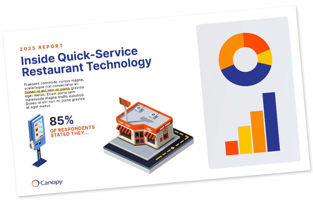
- A refreshed brand look. Isometric illustrations and Canopy’s core palette, but flipped toward a lighter, more inviting feel.
- 8-bit fast food icons. A retro nod to both technology and QSR that blended new illustrations with existing brand cues.
- A full departure. Playful cartoon-style graphics, new typefaces, and a look inspired by vintage restaurant menus and signage
Bringing the Research Report to Life
The client liked all three directions but chose the boldest option, much to our delight. Their trust opened the door to a creative design that felt like a departure while staying true to the brand. Details made the difference. The team added animated characters to bring the report to life in emails and on the landing page. We pushed beyond static graphics, creating a look that blended restaurant nostalgia with tech-savvy polish. Collaboration between INK and Canopy meant every choice from visuals to typefaces, even motion design, worked together toward the goal of attention and engagement.
The Payoff of Bold Design
The final report looked and felt different from anything Canopy had released before. Upon launch, it drew attention, sparked engagement on social media, and generated new opportunities for the sales team. Expanding beyond brand guidelines could have been viewed as a risk, but for Canopy, it was the reason the report stood out.
“When the client is willing to collaborate and push boundaries, you open doors to new, fun things. The very real human connection to broken tech in fast food – that relatable experience – is the key bit of info that really pushed us to be creative.”
– Ryan Riggins, INK Creative Director
At INK, we believe design is a lever for visibility. When brands invest in original research for content marketing, the way that research is brought to life can make all the difference. See more examples of how we’ve helped clients unlock that difference in our case studies and explore INK’s media reports — Be There Before, B2B Tech and Be There Before, Energy — that fuel our own storytelling.


