
If you’re a marketing or communications leader, a rebrand has probably crossed your mind, whether as a nagging itch or a response to a real shift in your business. INK launched its first major brand and website refresh in a decade, giving us a chance to reflect on the work we typically do for our B2B tech and energy clients, rather than ourselves. Questions like: What makes a B2B brand last? When is it time to change? And how do you build a flexible system that grows with your company?
I sat down with Emily Grossman (VP, Creative Services), Payton Ricci (Sr. Art Director), and Christian Rojas (Sr. Frontend Developer) to discuss INK’s brand and website updates and to get their advice for other B2B marketers considering the same move.
Designing for brand endurance.
The last time we gave INK a big brand refresh was nearly a decade ago. What gave our last brand longevity, and what finally told us it was time to evolve?
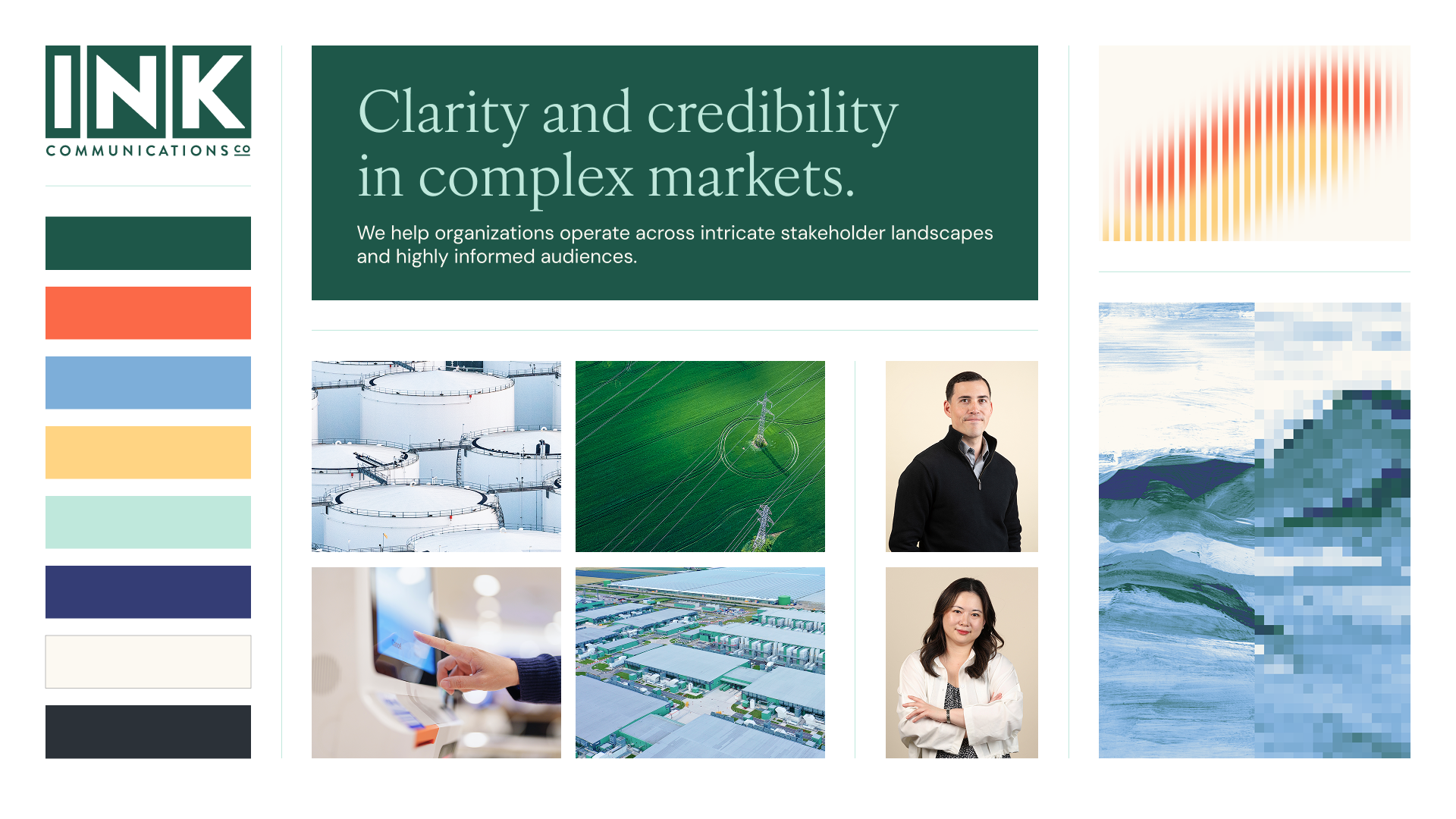
Emily: Our last brand was our most polished, complete system yet. It stayed true to INK’s personality while strategically speaking to the range of clients we work with. It was also our most intentional perspective yet because we took a stake in the B2B tech and energy markets for the first time. Narrowing our brand focus gave us a cleaner system we could apply across a lot of different materials in a way that would last.
So, what changed to spur a brand refresh?
Emily: For about five years, we sat comfortably with the brand. Then there were iterative changes that eventually led to visual inconsistencies. Once we noticed that, we looked more closely at INK’s positioning and voice and realized they no longer aligned with who we are today. We wanted to shift to a more professional, expert voice that better represented our authority and experience. And we needed to elevate our visual brand to align with that voice while remaining relevant to the industries we serve. So, it was time for a larger update.
Payton: I’d add that the signal to change can’t just be that the brand visuals are leaving something to be desired. It’s whether larger company messaging and personality shifts are happening that the visuals no longer reflect. Business, customer, and industry shifts can also create the need for change. For instance, looking at just the past few years, tech and energy have swung from more optimistic to more pragmatic postures.
How do you build a brand meant to serve INK for another decade, while still creating room for evolution?
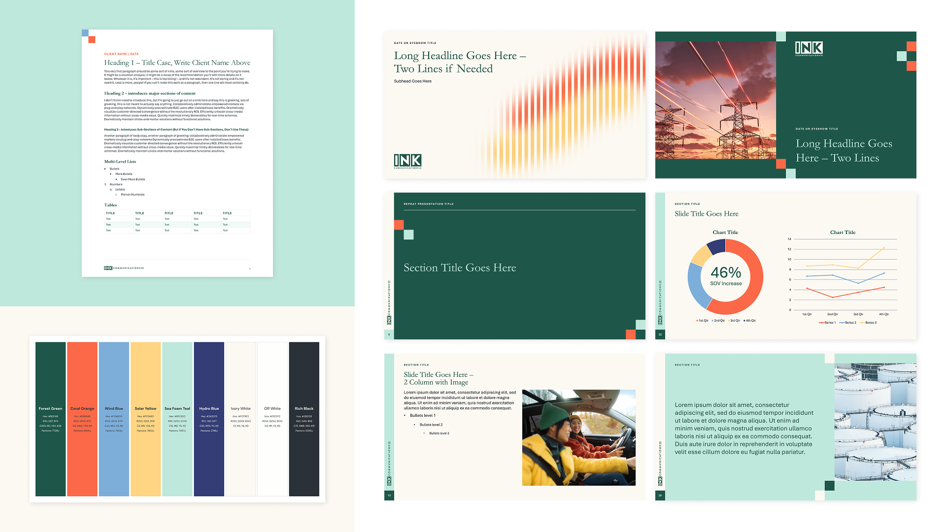
Emily: Having a clearly defined system helps set a foundation for longevity, but more importantly, there’s acknowledged room for growth. There’s likely to be iterative needs over time, and we’re setting ourselves up for that. We’ve also learned a lot from our experience working with INK’s tools and templates, like PowerPoint presentations, for example, so we’ve optimized them for how INK employees actually need the brand to function, not just how we want it to look. That sets us up for consistency and longevity.
Why human craft still matters.
You’ve described INK’s new brand direction as a “handshake between hi-tech and lo-fi.” What does that mean, and why did that tension feel right for INK?
Payton: The brand concept celebrates technological advancement and drive, while grounding it with human touches and perspective. The high-tech half is inspired by the industries INK serves and our deep expertise within them. Tech is always pushing toward what’s next, and energy has that same forward motion. Then, our human qualities are what ground the lo-fi half: calm under pressure, curious, trusted advisors, thoughtfully irreverent. This shows up in the brand’s more timeless aspects, like an elegant serif typeface. We also have painting textures with a handmade touch. These are grounding amidst the modern, “high-tech” aspects, like pixelation.
Why keep something distinctly human and tactile in a technology and energy brand?
Payton: With AI so prevalent now across marketing, design, and coding, it’s made it so easy to create things. But that level of human discernment and taste — real craft — is something you can’t replicate with AI. Emily predicted this in INK’s 2026 communications trends: that creative teams would demand outcomes rooted in technique and human touch.
The INK brand is communicating that we’re not just on top of the latest tech and energy trends, but we’re also great tastemakers with real expertise in crafting things that reach people on a human level. No matter how advanced technology gets, the customer is still human at the end of the day. That’s a big reason it was important to retain that sophisticated, tactile craft element in the brand.
A website that works for the brand and its evolution.
A major part of this brand refresh was updating the INK website. A website today has to do much more than look good and communicate clearly. It needs to perform across an increasingly complex digital and search environment. How did you think about balancing performance, accessibility, and SEO / GEO?
Christian: Good performance and accessibility mean the same thing, really; everyone can use the site no matter what device they’re on or what their needs are. For those aspects, it’s important to keep up with industry standards. How Google ranks sites changes every few years, and accessibility has governing bodies that set standards for it. That shapes the way I design components and systems.
Adhering to accessibility standards also helps with SEO and GEO because when crawlers read your site, they’re looking at the underlying structure of the page. Things like semantic HTML, clear content hierarchy, and properly labeled images make it easier for search engines and AI platforms to understand and index the site. Performance also impacts SEO. The standard now for a page to load is 2 to 3 seconds, and if you’re not hitting that, it hurts your ranking.
What about giving internal users (INK employees) the flexibility to update and evolve the new website?
Christian: Something that I keep at the forefront of my mind when developing—especially when developing the systems and the back end—is usability from any level of technical expertise. The goal is for the back end to be really usable and scalable, for now and in the future. I structured pages in a way that will make it easy to edit content and make changes over time.
What other B2B brands can learn.
The work we did here for INK—brand identity, web design, and development—are all services we offer to our clients. What did doing this for ourselves reinforce about how we approach brand and website work for others?
Payton: The most important thing is that we started with brand messaging, personality, and concepts. This wasn’t a superficial or purely aesthetic-based update. Grounding the brand strategy in broader company shifts, rather than trends and aesthetics, will give it greater longevity.
Emily: We were also intentional about getting and maintaining stakeholder alignment during the project, which is really important for any branding work. We established our key stakeholders at the very beginning, planned for their input throughout the process, and brought them along with each step, so they were invested in the success of the work.
More tactically, I’d recommend doing a materials audit as part of the brand refresh process. Once we aligned on the brand direction for INK, we looked hard at what touchpoints actually needed to be updated: PowerPoint templates, sales enablement materials, social media templates, email signatures and headers, and so on. Identifying everywhere the brand shows up helped us orient our execution and ensured employees could use the new brand effectively.
If you were advising a B2B company considering a major brand refresh, what would you tell them?
Payton: Don’t rush into an update if you can help it. Urgently reacting to a feeling—or feedback—that your brand is outdated or broken can lead to a piecemeal, band-aid solution. Whenever possible, take the time and space to ground a brand refresh in your company’s evolving industry, market position, messaging, voice, and personality. That measured approach will result in a much stronger, more strategic brand system that’s built to endure and evolve.
Thinking through what a rebrand or brand refresh could look like for your organization? Let’s talk through where to start.